The Calm and Serene Appeal of Cool Tones in Interior Design
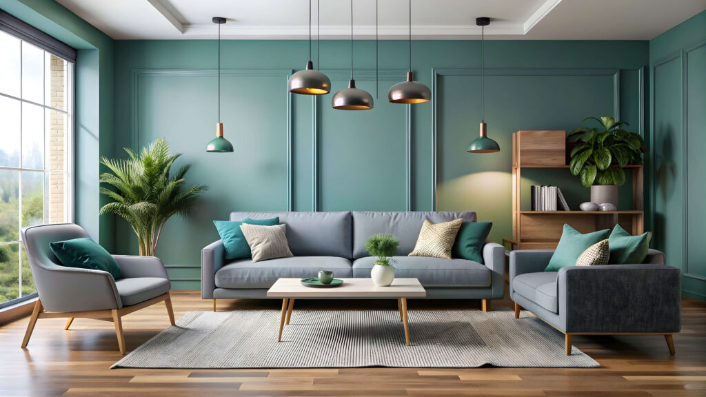
A cool tones colour palette in interior design is characterised by shades such as blues, greens, purples, and soft greys. These colours are known for their calming and refreshing effect, evoking the feeling of open skies, tranquil waters, and peaceful landscapes. Cool tones are ideal for creating serene, spacious, and modern interiors that promote relaxation and mental clarity. Here’s why incorporating a cool-toned colour palette can elevate the look and feel of your living space:
Creating a Calming Atmosphere
Cool tones are widely recognised for their soothing qualities. Shades of blue, green, and lavender are often used in spaces meant for relaxation, such as bedrooms, bathrooms, and meditation rooms. These colours naturally evoke a sense of peace and serenity, helping to reduce stress and create a calming environment. By using cool tones, you can transform a room into a tranquil retreat where you can unwind and rejuvenate.
Enhancing the Feeling of Space
Cool colours tend to recede visually, meaning they make spaces feel larger and more open. Lighter shades of blue, grey, and green reflect light and create an airy, spacious atmosphere. This makes cool tones ideal for smaller rooms or areas with limited natural light. By painting walls or choosing furniture in soft cool hues, you can open up a space and give it a more expansive feel.
Promoting Mental Clarity
Cool tones can have a positive impact on focus and mental clarity, making them perfect for workspaces, study areas, or home offices. Soft blues and greens are known to enhance concentration and creativity without being overstimulating. A cool-toned environment helps to create a sense of balance and order, fostering a productive and focused mindset.Modern and Sophisticated Aesthetic
Cool tones often lend a modern, sleek, and sophisticated look to interiors. Shades like icy blues, deep teals, and soft greys are commonly associated with contemporary design. These colours bring a clean, minimalist vibe to a space, perfect for achieving a modern aesthetic. Paired with metallic accents, like chrome or brushed nickel, cool tones can enhance a room’s elegance and sophistication while keeping the design crisp and streamlined.
Pairing with Natural Elements
Cool tones pair beautifully with natural materials like wood, stone, and glass. In a cool-toned room, materials such as light oak, marble, or textured stone stand out, creating a balanced contrast between the coldness of the colours and the warmth of natural textures. For example, a pale grey room with wood accents can feel both modern and inviting, offering a perfect blend of cool sophistication and natural warmth.
Versatility Across Design Styles
Cool tones are incredibly versatile and can be used across a variety of interior design styles. From minimalist and Scandinavian aesthetics to coastal and industrial designs, cool colours adapt seamlessly. In coastal-inspired interiors, soft blues and seafoam greens create a breezy, beachy feel. In minimalist spaces, cool greys and whites emphasise simplicity and cleanliness. No matter the style, cool tones can be tailored to suit your vision.
Combining Cool Tones with Warm Accents
While cool tones create a calming and open feel, they can sometimes benefit from being balanced with warm accents. Adding warm elements like wooden furniture, plush textiles, or brass lighting fixtures can soften the overall design and bring a sense of cosiness. For example, a cool gray room with mustard yellow cushions or a navy blue space with warm wood tones creates an inviting contrast that maintains the cool palette’s serenity while adding warmth and texture.
Playing with Depth and Contrast
Cool tones can be layered to add depth and contrast within a room. For example, pairing light blue walls with dark navy furniture creates a monochromatic colour scheme with rich visual interest. Incorporating different shades of the same cool colour family allows you to play with depth while maintaining a cohesive look. For more dramatic contrast, pair cool tones like teal or emerald with complementary warm colours, such as gold or terracotta, to add a dynamic flair to the room.
Using Cool Tones in Lighting
Cool-toned colours interact beautifully with both natural and artificial light. In naturally lit spaces, light blues and greens can reflect daylight to create a fresh, vibrant ambiance. In evening settings, these cool tones create a soothing and relaxed mood when paired with soft lighting. For a modern touch, use LED or fluorescent lighting with a cooler temperature to enhance the cool palette and emphasise the sleekness of the design.
Timeless Elegance
Cool tones offer a timeless elegance that can easily withstand passing trends. Classic shades of blue, from pale sky tones to rich navy, have long been used in both traditional and contemporary interiors. Green tones, like sage or forest green, also offer a natural sophistication that feels enduring and grounded. By choosing cool hues for walls, furniture, or accessories, you can create a look that feels current yet timeless, providing long-lasting appeal for years to come.
Conclusion
A cool tones colour palette offers serenity, modern sophistication, and a versatile foundation for various interior design styles. Whether you’re aiming to create a calm retreat, a modern minimalist space, or an airy and open room, cool tones provide the perfect backdrop. Their ability to enhance light, promote relaxation, and pair beautifully with natural elements makes them a favourite for designers seeking both functionality and aesthetic appeal. With the right balance of shades and textures, cool tones can transform any interior into a harmonious, elegant, and timeless space
Inweaver Technologies Pvt. Ltd,
5B, 2nd Floor, 10th Cross, RMV Extension, Sadhashivanagar,
Bangalore 560080. India
support@inweaver.com
Phone +91 63633 87505