The Cozy and Inviting Charm of Warm Tones in Interior Design
A warm tones palette in interior design consists of colours that evoke a sense of warmth, comfort, and cosiness. These hues, often inspired by nature’s elements like the sun, fire, and earth, include shades of red, orange, yellow, deep browns, and warm beiges. Warm tones have a way of making spaces feel inviting and intimate, perfect for creating welcoming atmospheres in homes and social areas. Here’s why a warm colour palette can enhance your interior design:Creating a Welcoming and Cozy Environment
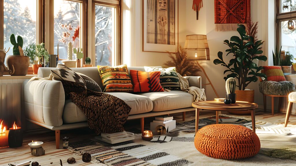
Warm tones are known for their ability to make a space feel cosy and inviting. Colours like burnt orange, mustard yellow, terracotta, and warm beige radiate a sense of comfort and relaxation. These colours are perfect for living rooms, dining areas, and bedrooms where you want to foster a sense of warmth and hospitality. A room designed with warm colours feels like a comforting embrace, making it ideal for spaces where family and friends gather.
Adding Energy and Vibrancy
Warm colours are often associated with energy, enthusiasm, and passion. Bright shades like fiery red, sunny yellow, and vibrant coral infuse a room with a sense of vitality and excitement. These tones can stimulate conversation and activity, making them ideal for social spaces like kitchens, dining rooms, or entertainment areas. A pop of warm colour can enliven a neutral room and create a lively, energetic environment.
Enhancing Natural Light
Warm tones work beautifully with natural light, amplifying the warmth of sunlight streaming into a room. Golden yellows, deep reds, and warm browns reflect light in a way that enhances the cozy feel of a space. In rooms with ample natural light, these colours glow and create a sun-kissed atmosphere that feels both cheerful and soothing. Even in rooms with limited natural light, warm colours can give the illusion of a brighter, more radiant space.
Bringing Depth and Comfort
A warm colour palette offers an opportunity to create depth and richness in a room. Darker shades like deep burgundy, rust, or chocolate brown can add a sense of luxury and sophistication to the space. These tones bring a sense of cosiness, making larger spaces feel more intimate and grounded. By layering different warm tones, such as pairing lighter beiges with darker ochres or reds, you can create a multi-dimensional look that feels rich and comforting.
Encouraging Relaxation
While warm tones are often associated with energy, deeper shades like warm browns, muted oranges, and soft terracottas can also promote relaxation. These colours have a grounding effect that encourages rest and reflection. Bedrooms and reading nooks designed with warm tones create a sense of calm, making them the perfect spaces to unwind after a long day.
Complementing Natural Materials
Warm tones complement natural materials like wood, stone, and leather beautifully. In an interior design that features these materials, warm colours can enhance their texture and richness. A wooden floor paired with a warm beige or terracotta wall, or leather furniture against a backdrop of warm yellow, creates a cohesive and harmonious look that feels natural and organic. The connection to nature through both colour and material adds a timeless, earthy quality to the space.
Perfect for Creating Focal Points
Warm tones are excellent for drawing attention to specific areas of a room. A bold red accent wall, a mustard yellow sofa, or a warm-toned piece of artwork can serve as a focal point, immediately capturing attention and adding visual interest. These colours are perfect for highlighting architectural features, like fireplaces or built-in shelving, making them stand out and enhancing the room’s design.
Pairing with Neutrals
Warm tones pair well with neutral colours, offering balance and sophistication. Neutral shades like cream, ivory, and grey can temper the intensity of warmer hues while still allowing them to shine. For instance, a beige wall with warm red or orange accents creates a balanced, elegant look that feels both calm and inviting. By pairing warm tones with neutrals, you can maintain the vibrancy of the colours while creating a more subtle and refined atmosphere.
Creating an Intimate Ambiance
Warm tones are ideal for creating intimate, cosy spaces. In smaller rooms or areas where you want to foster a sense of closeness, like dining rooms or reading nooks, warm colours make the space feel enveloping and comforting. Darker warm shades like burnt sienna or chocolate brown create a sense of enclosure, perfect for spaces meant for conversation or relaxation.
Versatility Across Design Styles
Warm tones work well with a wide variety of interior design styles, from rustic and bohemian to contemporary and eclectic. In rustic designs, earthy browns and oranges evoke a connection to nature and craftsmanship. In bohemian spaces, warm yellows, reds, and pinks create a vibrant, free-spirited atmosphere. Even in modern and minimalist designs, warm tones can add a touch of softness and approachability, preventing the space from feeling too cold or stark.
Conclusion
A warm tones palette in interior design is an excellent choice for creating spaces that feel cosy, inviting, and full of energy. Whether you’re using rich, deep shades to add warmth and intimacy or brighter hues to inject life and vibrancy into a room, warm tones have the power to transform your home into a welcoming and comfortable retreat. Their versatility allows them to complement natural materials, create focal points, and bring a sense of timeless elegance to any interior style. Whether used as the main colour scheme or as accent tones, warm colours will always leave a lasting, positive impression.
Inweaver Technologies Pvt. Ltd,
5B, 2nd Floor, 10th Cross, RMV Extension, Sadhashivanagar,
Bangalore 560080. India
support@inweaver.com
Phone +91 63633 87505