The Beauty of Monochromatic Color Palettes in Interior Design
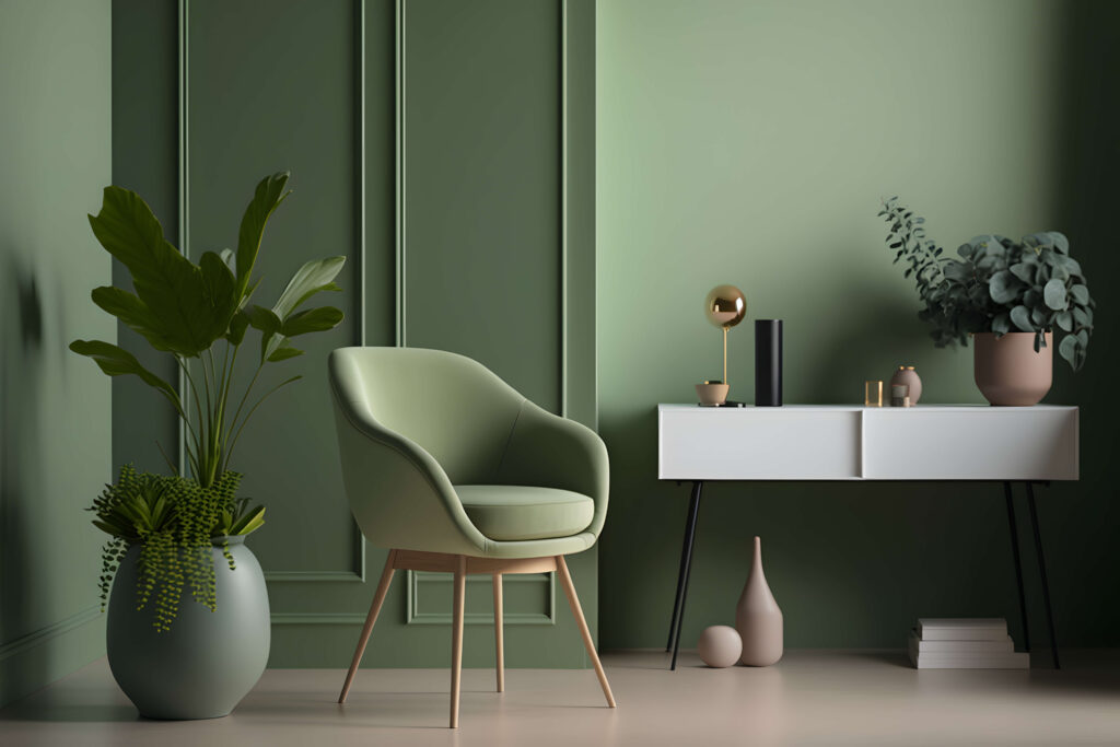
A monochromatic colour palette in interior design is an elegant and sophisticated approach that revolves around using various shades, tints, and tones of a single colour. Often misunderstood as boring or one-dimensional, this style actually offers a surprising amount of depth and flexibility. The monochromatic palette provides a cohesive, harmonious look while allowing for creativity through texture, contrast, and visual interest. Here’s why a monochromatic colour scheme can transform a space into something truly stunning:
Creating Visual Harmony
One of the primary advantages of a monochromatic colour palette is its ability to create a harmonious and balanced look. Since all the colours come from the same base hue, they naturally complement each other. This makes the space feel unified and seamless, avoiding visual clutter or jarring contrasts. The result is a room that feels serene and well thought out, where every element contributes to a cohesive design.
Adding Depth Through Variations
Monochromatic doesn’t mean monotonous. In fact, using various shades, tints (lighter versions), and tones (darker versions) of a single colour adds depth and dimension to the space. For example, layering a soft pastel blue with deeper navy accents or mixing light and dark greys can create subtle contrast while maintaining unity. This approach prevents the room from feeling flat and allows for dynamic visual interest without overwhelming the senses.
Focus on Texture and Materials
When working with a monochromatic palette, texture becomes crucial. Since the eye isn’t distracted by a variety of colours, materials and textures become the primary tools for adding richness and character to the room. Think of plush velvet cushions on a sleek leather couch, a rough stone fireplace against smooth painted walls, or a woven rug over glossy wooden floors. These elements bring variety and depth to the design, making the space tactile and inviting.
Sophisticated Simplicity
Monochromatic interiors exude elegance and simplicity. They strip away the complexity of mixing multiple colours, resulting in a clean, sophisticated aesthetic. Whether you’re using bold or subtle tones, the simplicity of sticking to one colour gives the space a modern, high-end look. This minimalist approach is particularly effective in contemporary or Scandinavian-inspired interiors, where restraint and balance are key.
Creating a Focal Point
A monochromatic palette offers an excellent backdrop for a statement piece or focal point. By sticking to one colour, you can make a bold feature, such as an oversized piece of art, a dramatic light fixture, or a standout piece of furniture, take centre stage. The lack of competing colours draws attention to the focal point, giving it maximum impact in the room.
Playing with Light and Mood
The way different shades and tones of a colour interact with light can greatly affect the atmosphere of a room. Lighter tones tend to reflect more light, making spaces feel larger and more open, while darker shades absorb light, creating a cosier and more intimate ambiance. With a monochromatic scheme, you can carefully control the mood by choosing where to use darker or lighter variations of the colour. For instance, lighter shades can be used in communal spaces like living rooms or kitchens, while darker tones can create a cocoon-like effect in bedrooms or reading nooks.
Timeless and Versatile
A monochromatic colour palette offers timeless appeal. Unlike trendy colour combinations that may fall out of favour, a well-executed monochromatic scheme remains elegant and relevant through the years. It is also highly versatile—depending on the colour you choose and goes well with modern and minimalist to rustic or traditional. A monochrome space can be calm and understated with neutral tones or bold and dramatic with a single rich hue.
Easier to Style and Update
Working within a monochromatic colour palette simplifies the process of styling and updating a room. Since the colours all come from the same family, it’s easier to introduce new decor pieces without worrying about clashing shades. Additionally, small tweaks—like adding a few accessories or switching up textiles—can refresh the look without disrupting the overall design. This makes it easy to change the feel of the space with minimal effort, whether you’re going for a cosy winter look or a breezy summer vibe.
Enhancing Architectural Details
A monochromatic palette can also highlight the architecture of a space. With fewer distractions from a variety of colours, structural elements like mouldings, beams, or architectural features stand out more. This is especially effective when the chosen colour enhances or complements the existing architectural style, giving it more prominence and making the room feel more structured and intentional.
Conclusion
A monochromatic colour palette is a sophisticated and dynamic approach to interior design that emphasises harmony, texture, and balance. Far from being dull, it offers a world of creativity through variations in tone, shade, and texture. Whether you’re aiming for a sleek, minimalist look or a more layered and inviting space, monochromatic design allows for flexibility and personalisation while maintaining a cohesive and timeless aesthetic. It’s a design strategy that brings depth, focus, and elegance to any space
Inweaver Technologies Pvt. Ltd,
5B, 2nd Floor, 10th Cross, RMV Extension, Sadhashivanagar,
Bangalore 560080. India
support@inweaver.com
Phone +91 63633 87505